If you have read any of my blogs at all, you will know that I love and use appliques, A LOT! I think they are the #1 friend of a fabric artist because they are the storytellers, which is what fabric art is all about.
Things Weren’t Always this Good, Kids
I used to avoid appliques like the plague when I first started because they seemed to be too difficult and time consuming. And they really can be if you follow all the ‘rules’ about how they should be cut and applied.
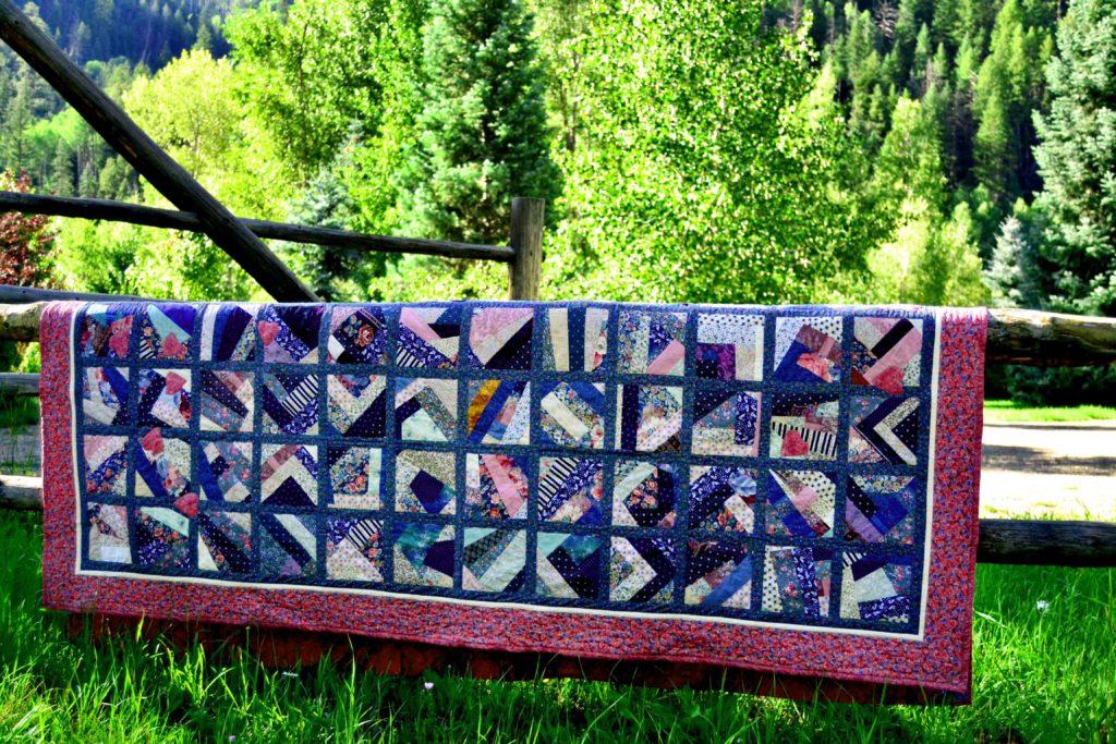
Learn how to applique to create magnificent statement & landscape quilts
I had a friend who once made a quilt that had a swath of flower appliques across one bottom corner.
Sound simple? Think again. That “simple” took her almost 2 years to stitch on (by hand) with stitches so tiny that her husband finally bought her a large, stand-up magnifying glass that she could use to see her own stitching. The whole process gave her major headaches, and I was absolutely horrified by it all and swore off appliqueing for life.
When I started creating my own fabric art, however, I realized several things:
- I hate matching corners, so I had to find a different quilting style
- Landscape is an amazing alternate style, but you can’t do it if you can’t applique
So, with gritted teeth, I bought some how-to books and started learning. Being me, it didn’t take long to come up with a faster and easier way to do this, which I want to share with you here.
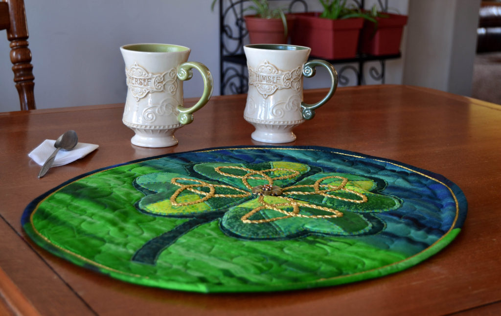
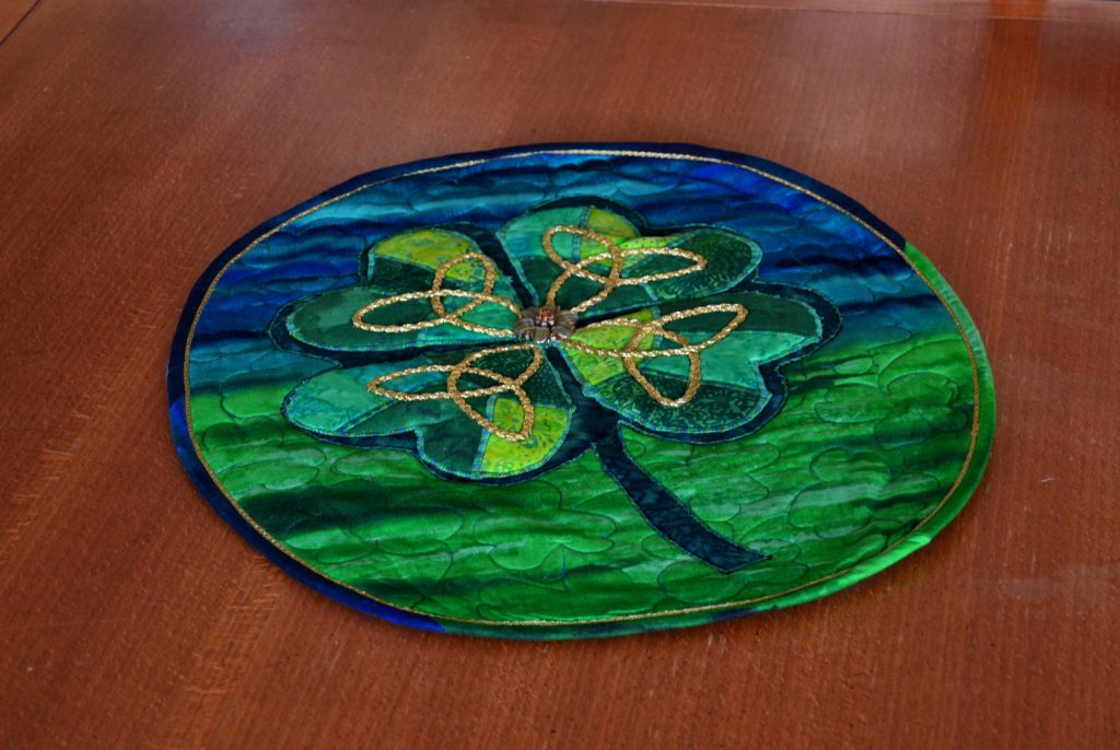
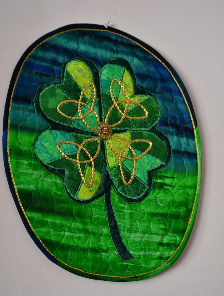
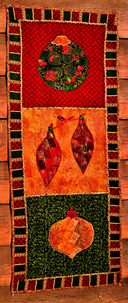
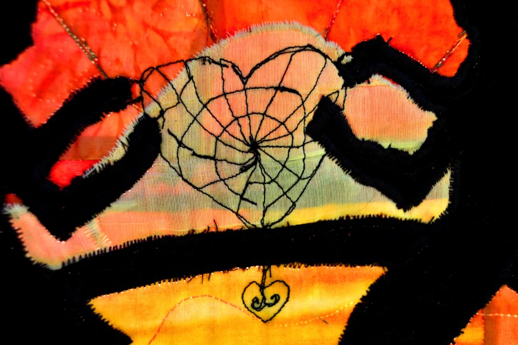
In the case of this panel, first the dark green background shamrock was appliqued down. Then the broken hearts were appliqued down. Then the golden rope was sewn down. Learning how to applique makes creating unique and beautiful projects like this one a fun and easy adventure.
Break the Mold – Bend the Rules
First of all I asked myself; “Who’s ever going to look that closely at my friend’s painstaking appliqueing job on that quilt?”
Answer, probably no one, and if they do, they’re likely Quilt Nazis and who cares what they think anyway?
Certainly not me!
My mom – who was an extremely accomplished clothing seamstress used to say if someone was going to look that closely, then they had problems she didn’t want to even think about. I guess that’s where my attitude comes from.
So, keeping that in mind, I came up with my quicker, faster, easier version of appliqueing.
Principle #1 – Any Shape Known to Mankind Can Be Made Into an Applique
It’s not just about flowers, hearts, and stars. Literally anything you can conceive of can be made into an applique.
When I first started, I followed the appliqueing protocols and made my appliques out of tiny little different colored pieces of fabric that I laboriously cut out, laid down and stitched to make it look like a rose or whatever.
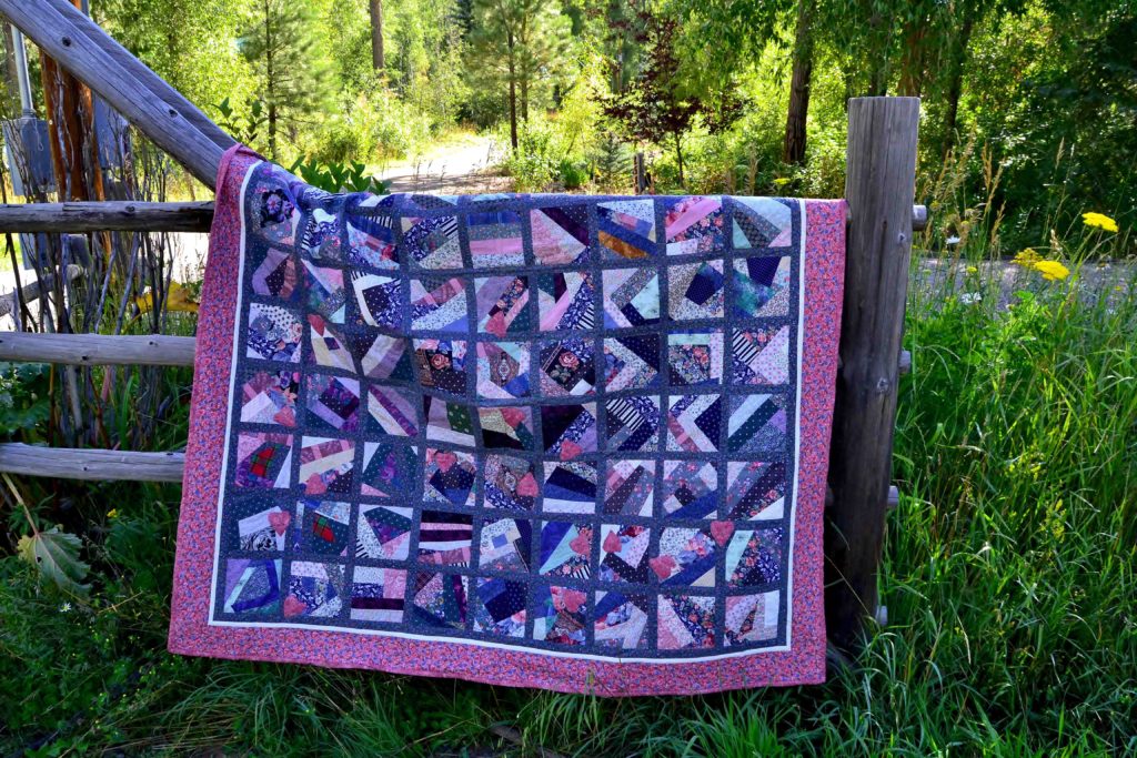
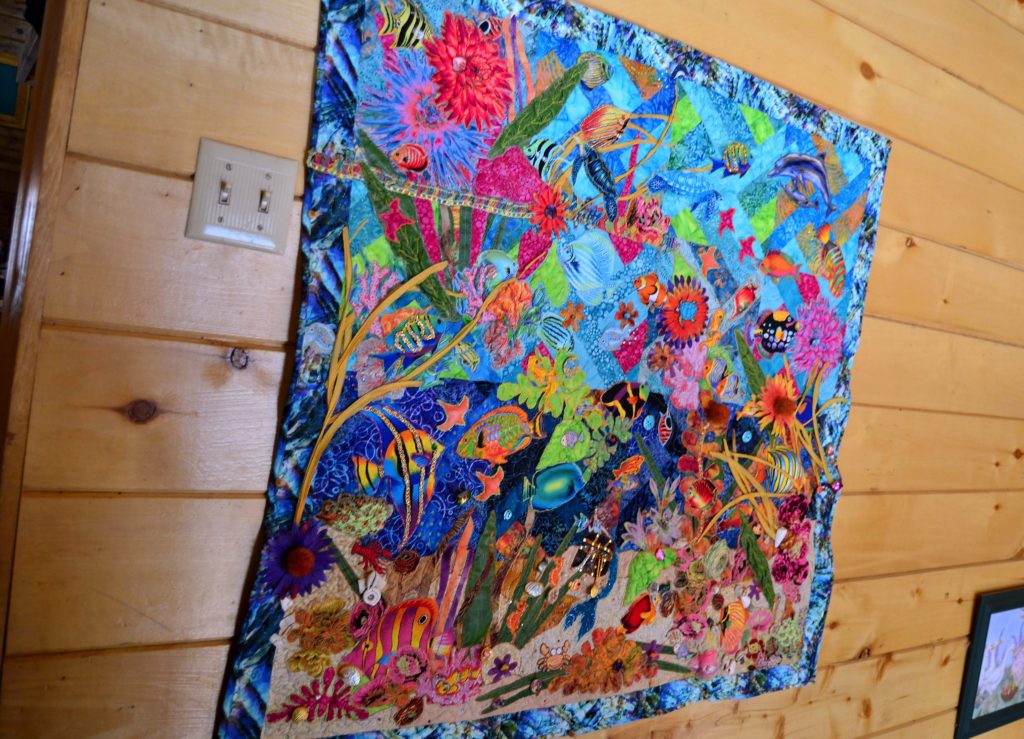
This quilt was one of the first places I used applique for an art project. 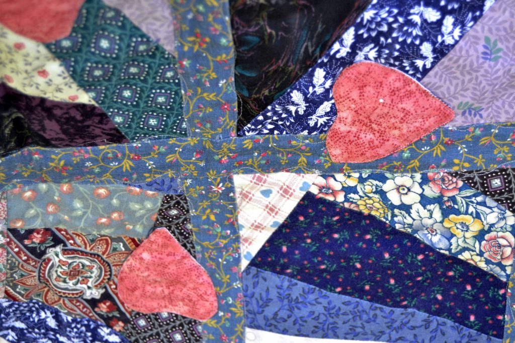
It seems incredible, but these appliques covered holes that were developing in these vintage squares. 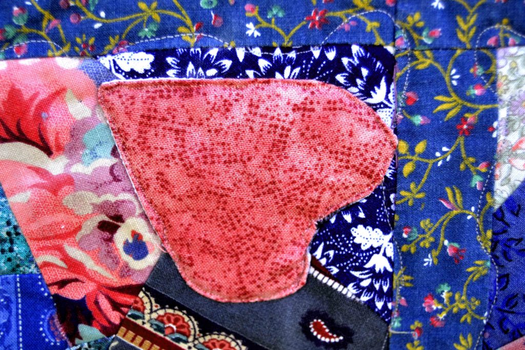
As a quick aside, if you get into any quilting style you’ll likely figure out an easier way to do it sooner or later. But remember, emulate before you innovate. Doing it the “right way” the first time helps you understand the principles behind these techniques.
With that being said, it only took this one project to make me go seeking a better way.
Principle #2 – Keep it Simple
It’s very hard to translate an elaborate shape with lots of little pieces, etc. into a fabric applique. So look for the simplest outline you can find.
I prefer to use big appliques in single blocks. For instance, it’s much easier to get a custom rose applique if you fussy-cut an image out of a printed fabric swatch and use our easy process to turn any piece of fabric into a custom applique instead.
For other custom appliques I make a habit of envisioning the end result in my mind, and then figuring out the easiest way to translate that to fabric.
I can see what I want in my mind, but translating that into fabric is something else so I went looking for help. My favorite resource for this is coloring book shapes on Google. If you type ‘Treasure Chest Coloring Book Shapes’ into your search engine, you will get pages of outlines of treasure chest shapes to choose from! Or:
Absolutely anything. It’s marvelous! Here is how to applique using these types of shapes:
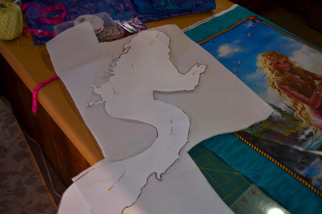
- Mermaid shapes
- Rockets
- Dragons
Print Out 2 Copies of the Shape You Want
One the size you’re going to use, and a small one as a guideline, because once you cut the big shape into pieces, it’s often hard to figure out how it all goes back together.
Plan a 3-Dimensional Outcome
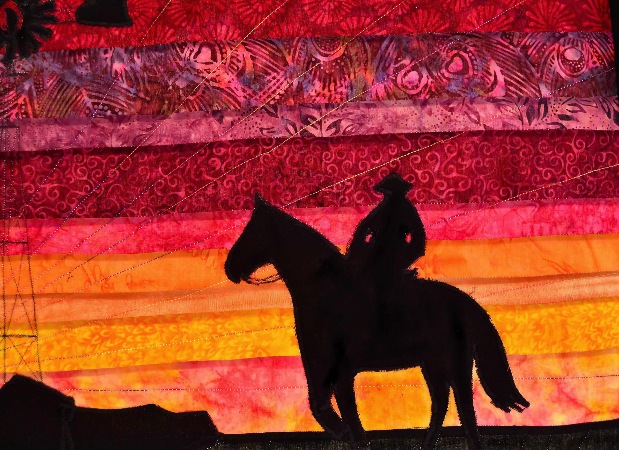
Some appliques can be cut out of just one piece of fabric – silhouettes – for example; but if you want the others to look more realistic, you’ll have to use more than one fabric.
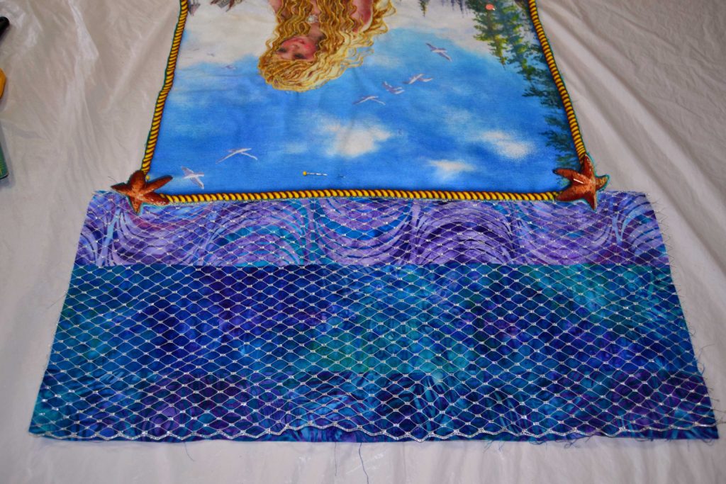
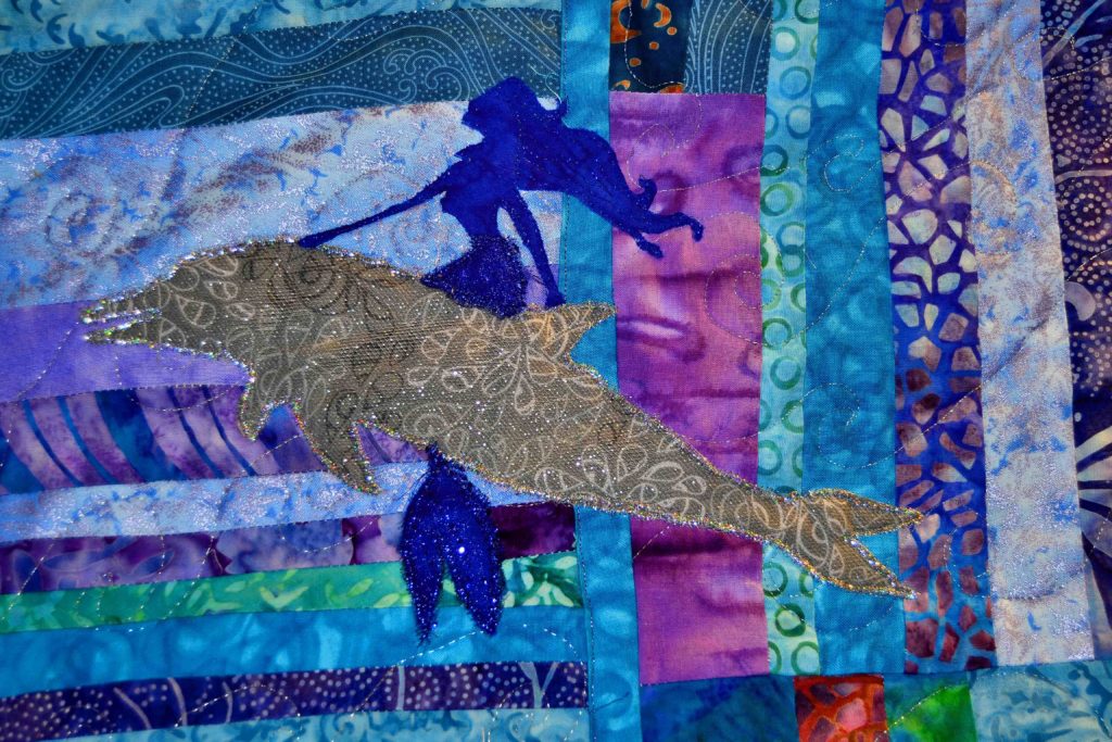
My treasure chest applique on my Ocean Maidens quilt was made using a few simple layering steps:
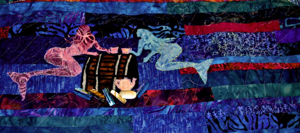
- The top and front pieces were a dark brown fabric
- The end (or side of the chest) piece was black. This makes the chest look 3-D in shading terms
- The “steel” strapping was gray fabric
- The lines in the boards were made with thin black yarn
You can also add hardware in the form of buttons to make a clasp or lock, or use hot-fix studs to effect the metal work on a treasure chest. With these simple principles you can make any shape you want into a beautiful, 3-D layered applique.
Another panel, another style of treasure chest and a mermaid! 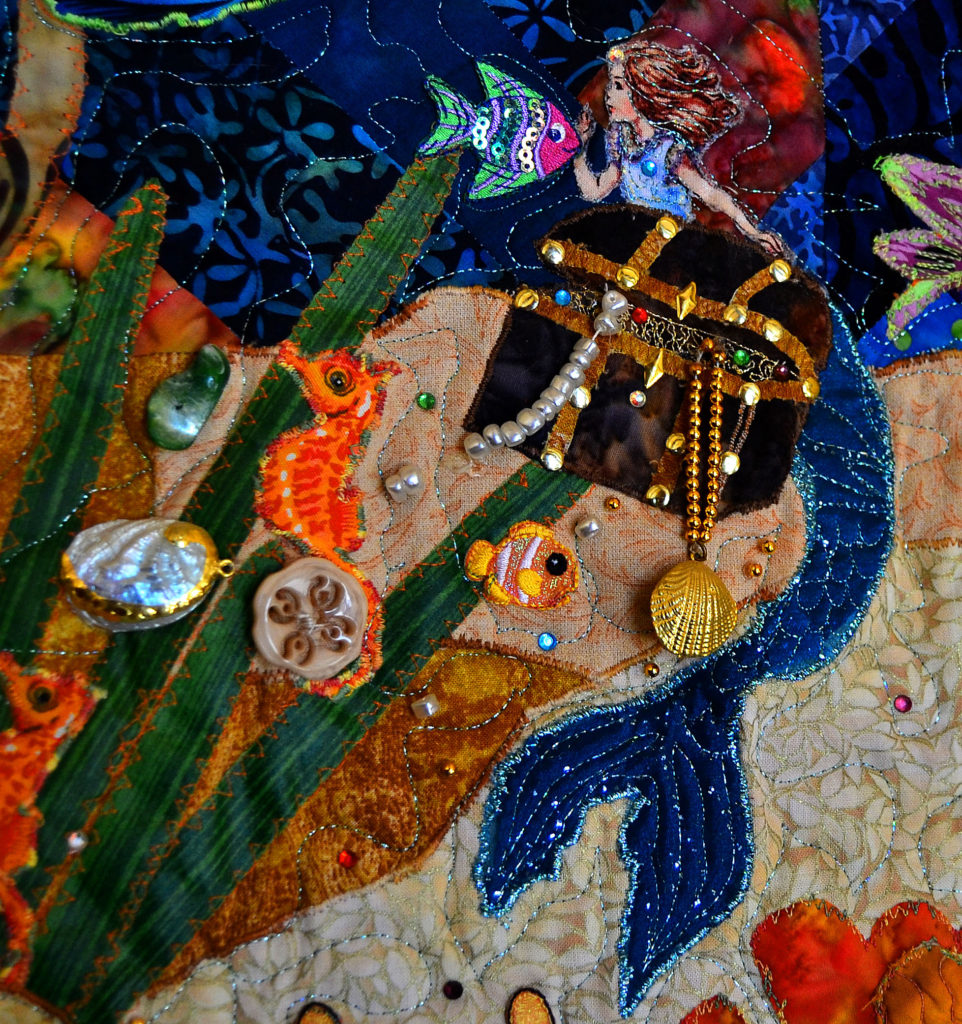
Fussy Cutting Magic
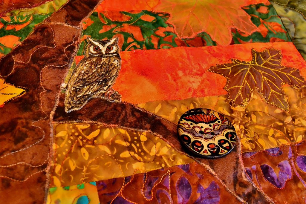
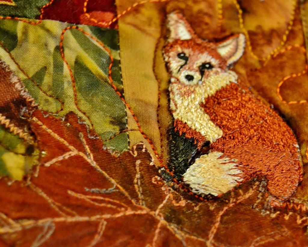
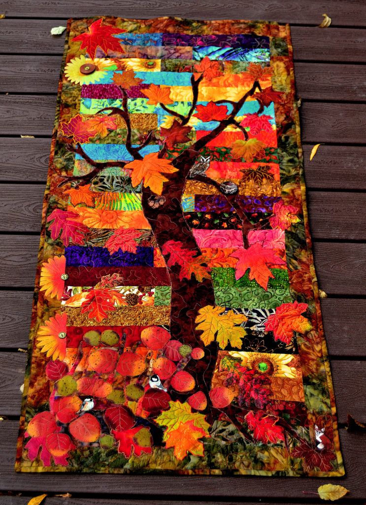
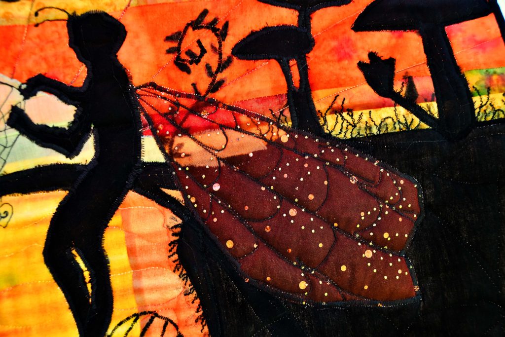
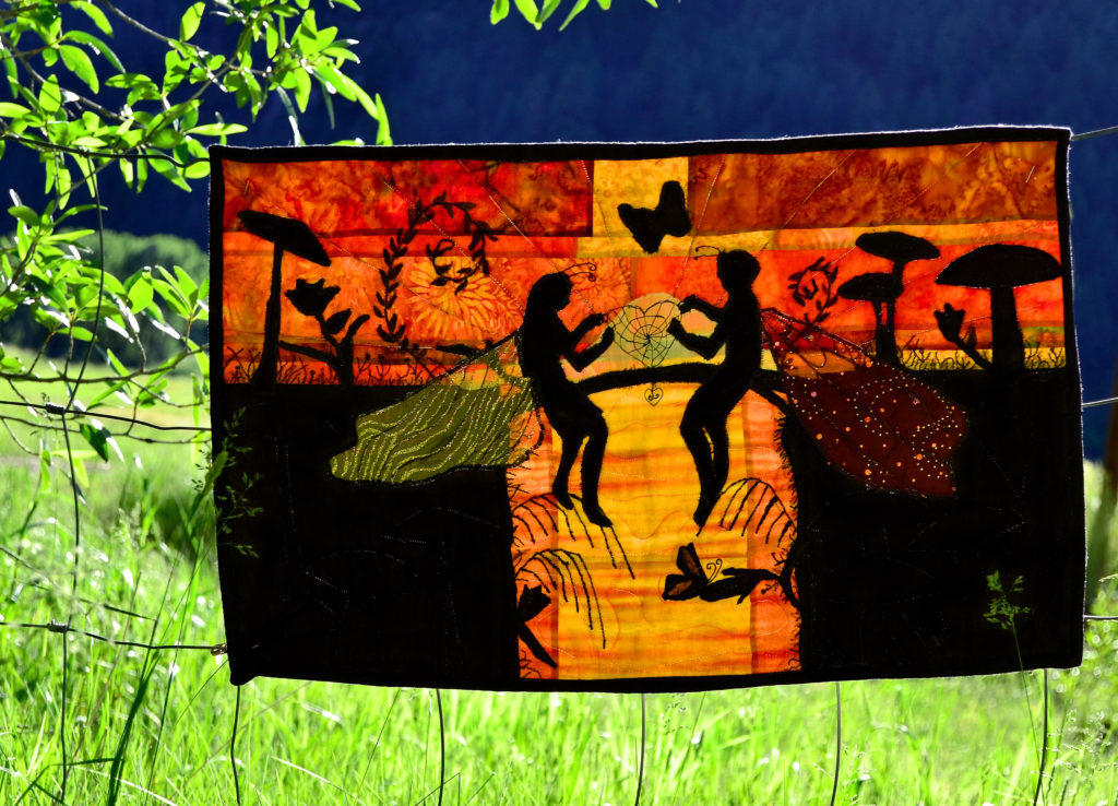
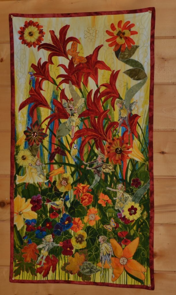
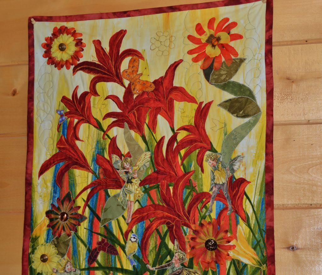
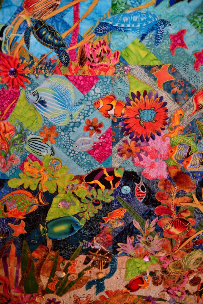
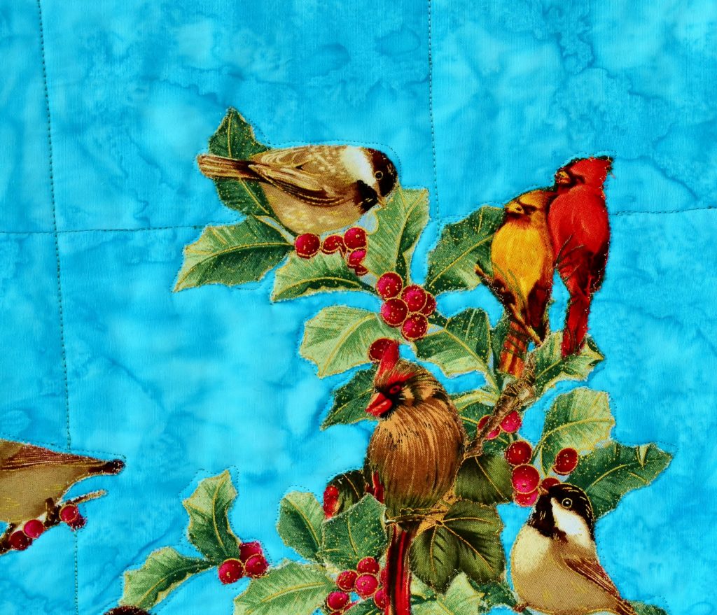
This is simply cutting an image you want out of a larger piece of fabric. The cardinals in my ‘Autumn Daze’ panel and my ‘Christmas Carolers’ were made this way, as well as all the fairies I put in anywhere I can.
You can add paperbacked soft-fuse to these images, and then use judicious stitching to pop out the 3-D effect.
Birds cut from one panel to stand out in another 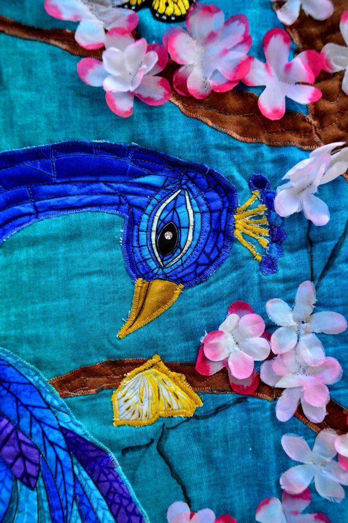
The peacock and butterfly were both fussy cut from different panels
This is one of my very favorite time-saving techniques when we’re talking about how to applique, but as it’s a longer, more involved technique we’ll do an article all about this later. But the most important tip for fussy cutting is to always use a small pair of scissors with very sharp points, to get into those very small areas in every shape.
Apply Paperbacked Soft-Fuse to Every Piece Before You Cut the Applique Out
This helps to stabilize your fabric making it easier to cut out. The soft-fuse also nips fraying in the bud for long periods of time, and it enables you to iron your applique down right where you want it – you can even re-position your piece once or twice if you didn’t get it right the first time.
Believe it or not… 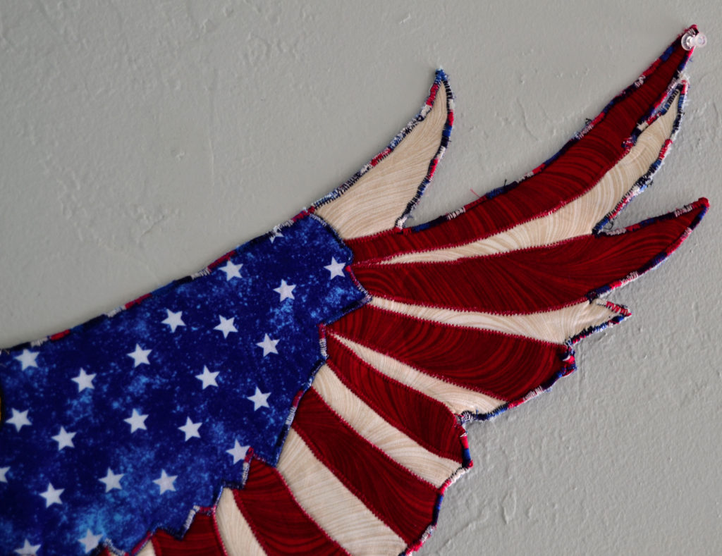
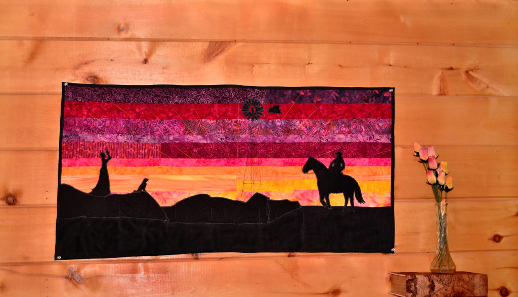
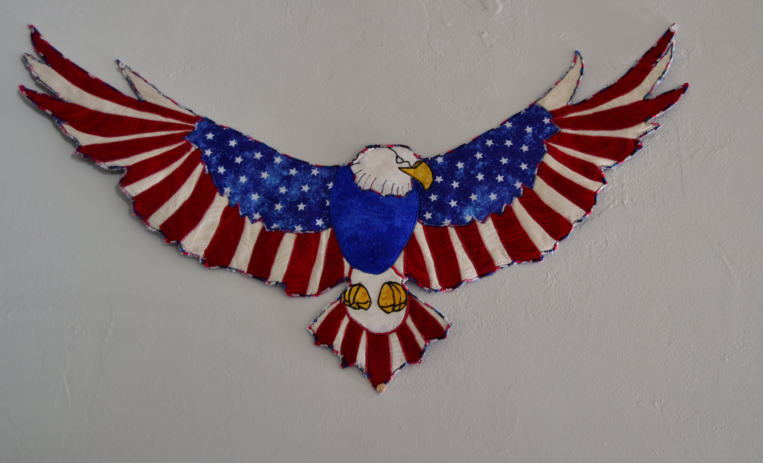
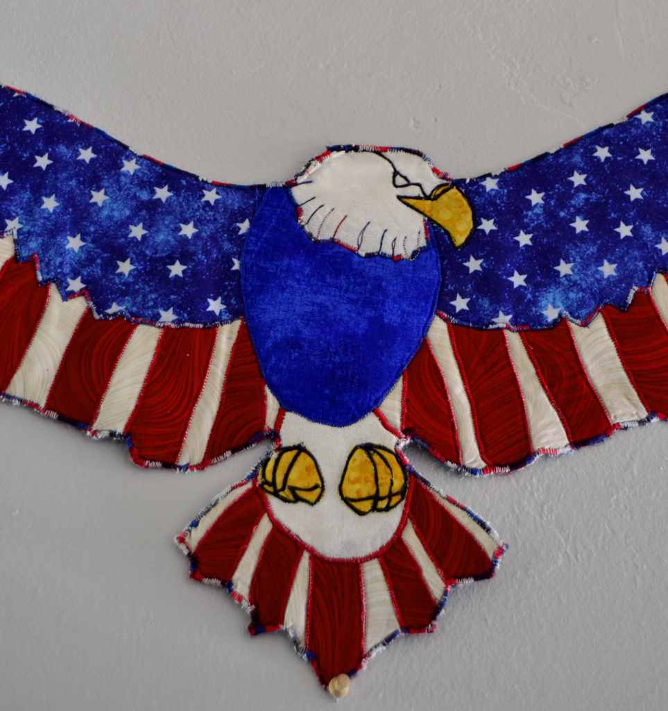
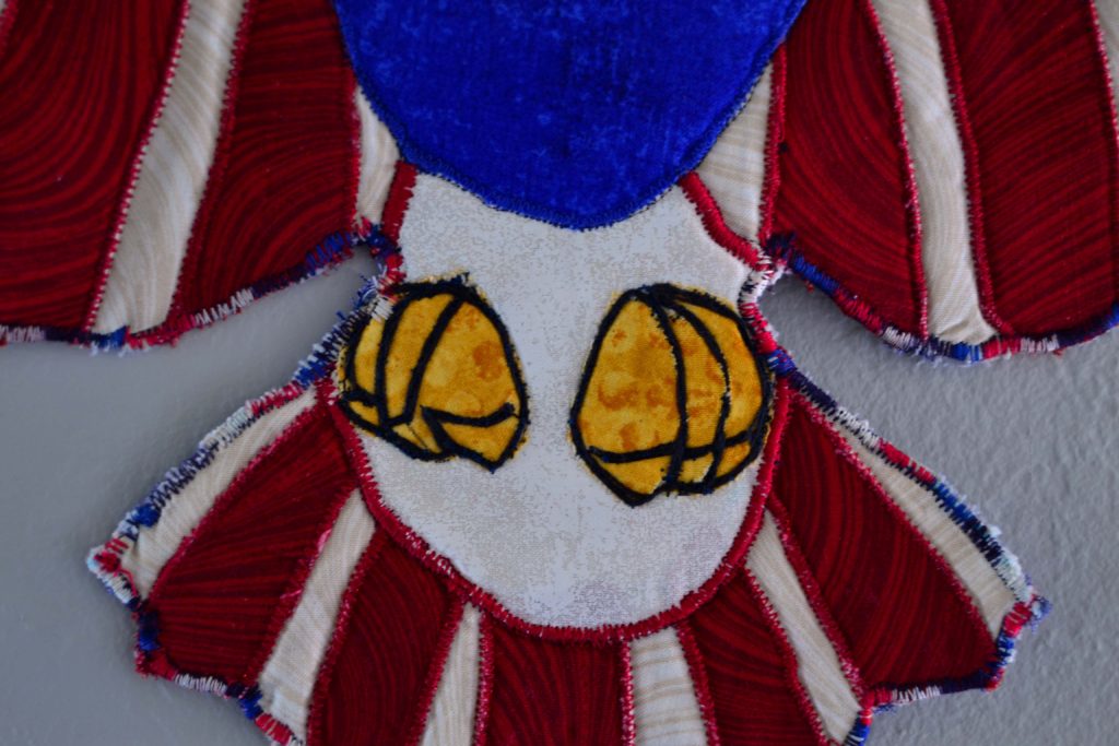
The red feathers on our Freedom Flight panel are all appliqued down 
There’s another article about this product, and you can read it anytime.
Principle #3 – How to Applique – The Actual Sewing-it-Down-Right Part
Whew, we’re finally to the actual applique part of this project. And here you have to make two important choices; thread and stitch type.
Thread Choice
Do you want your applique or the thread itself to be the real pop-out star of the show?
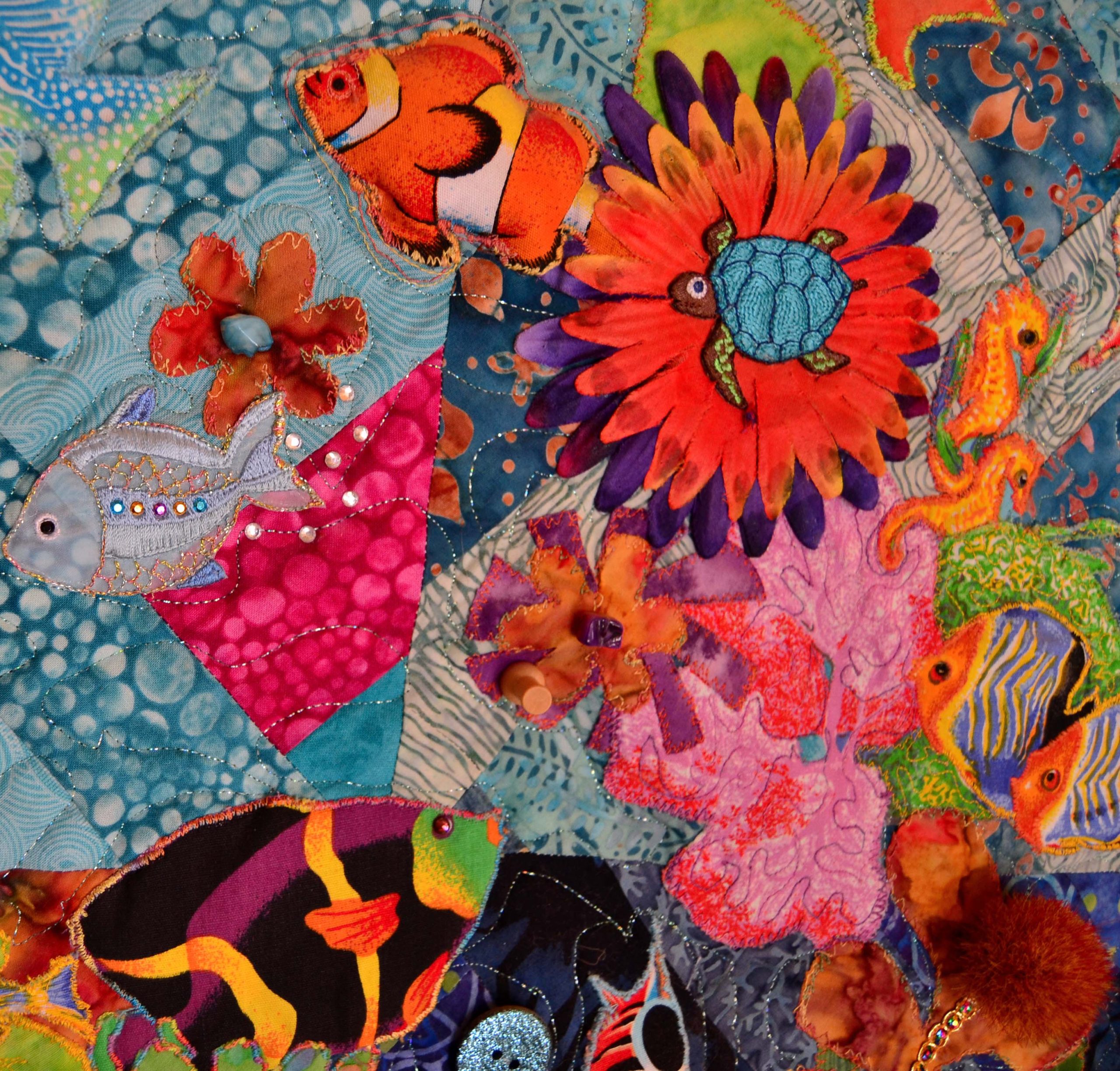
If it’s your applique, then choose a matching or an invisible thread that mostly disappears unless you look very carefully. This allows the applique to shine forth.
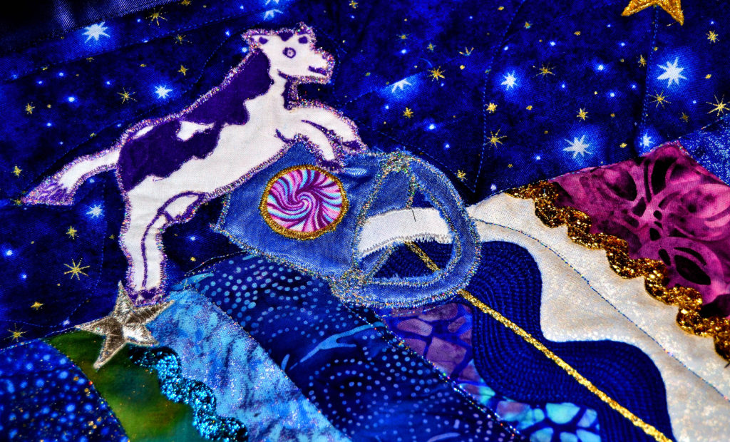
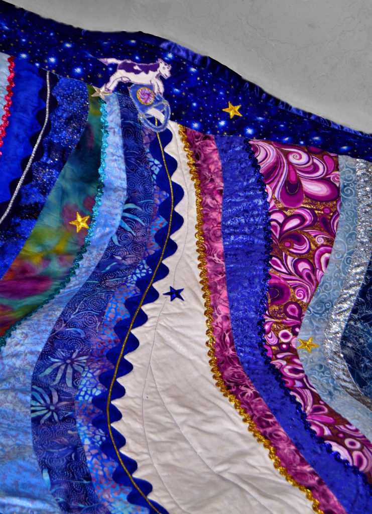
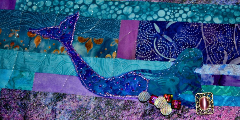
If you want the thread to pop – which is something I usually go for when doing flowers or mermaid tails – then choose thread that is a couple of shades darker or lighter than your applique so that it will show up well. Variegated threads and metallic threads work very well for this.
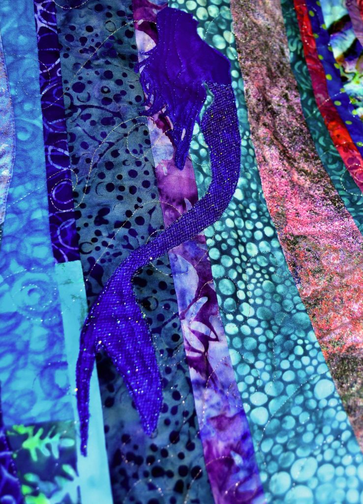
Without metallic threads these mermaids would fade into the background – plus mermaids are magical, and should sparkle! 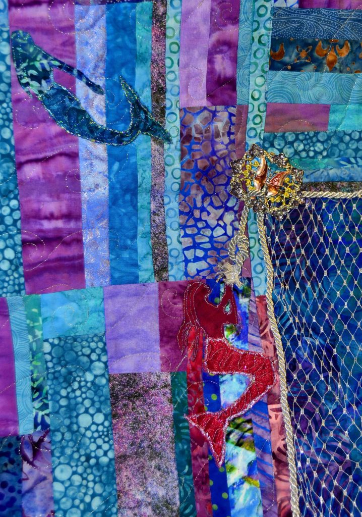
How to Applique Using the Right Stitch Type
I use three different types of stitches depending on the effect I’m going for.
Straight Stitch
This is when you stitch just along the inside edge of your applique. When you apply any type of soft-fuse product you control the fraying somewhat, but you can’t stop it completely. This is known as raw-edge applique, because when you stitch a straight line around an applique you will have a small amount of fraying and the outer edge will look a little ragged.
I’m not a big fan of this look unless I’m making something that should look fuzzy and fray-ish, like grass, etc. However, appliqueing with a straight stitch uses a lot less thread and is by far the fastest way to sew an applique down.
Straight stitch also works best for appliques that won’t fray, such as embroidery appliques that you buy at the store.
And, sometimes, when you’re doing detail work – like on a mermaid’s face, for example, you just have to do it and put it as close to the edge as possible.
Blanket Stitch
A blanket stitch is a straight stitch that throws in one zig-zag stitch every 3rd or 4th stitch. It’s a great combination of a straight stitch’s neatness, and a zig-zag stitch’s security.
How to applique with a blanket stitch is also a relatively easy concept – as you don’t have to go as slowly or be so extremely accurate going around the outside of an applique. The one zig-zag will catch your applique if you miss the straight stitch part.
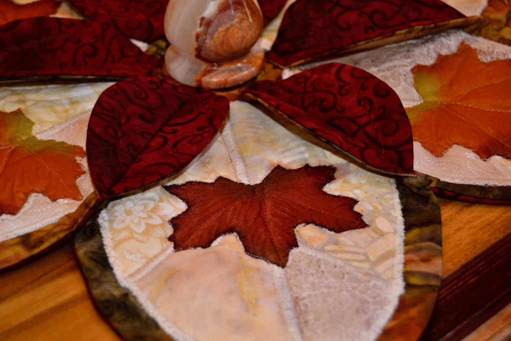
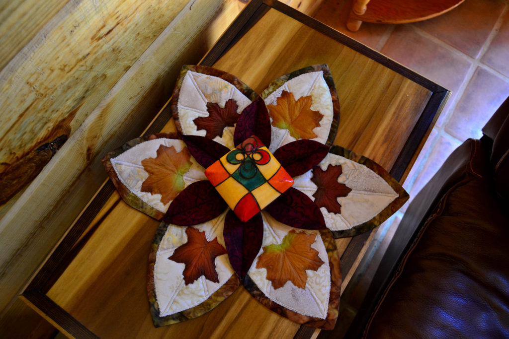
I use this stitch a lot on my fabric appliques like leaves, flowers, etch. They don’t fray hardly at all, and the blanket stitch mostly disappears on them, so it looks as if they’re just lying there by magic.
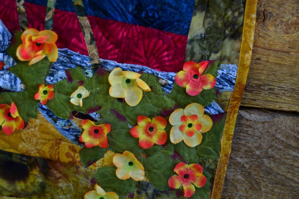
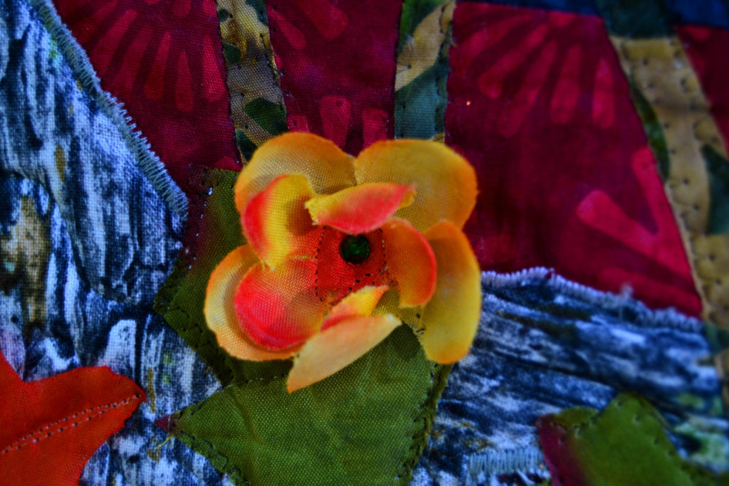
These types of silk leaf and flower appliques are sewn down using either straight or blanket stitches, while the tree roots behind them are appliqued down with a satin stitch.
If your sewing machine will allow it, you can also reverse the direction of a blanket stitch to accommodate your natural right-or-left-hand sewing direction.
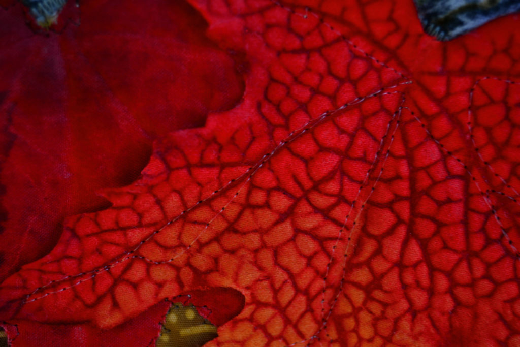
Zig-Zag Satin Stitch
This is my favorite appliqueing stitch because it finishes up your edges so beautifully and stops all those little frays in their tracks.
I’m NOT a fan of fraying – as you might have guessed. Actually, I loathe fraying, and I often feel as though I’m in a war against those picky little threads. As I sew each section of a quilt together and the frays are incorporated into the seams, I perform a little victory dance in my head.
With a tight zig-zag satin stitch you can conquer your frays.
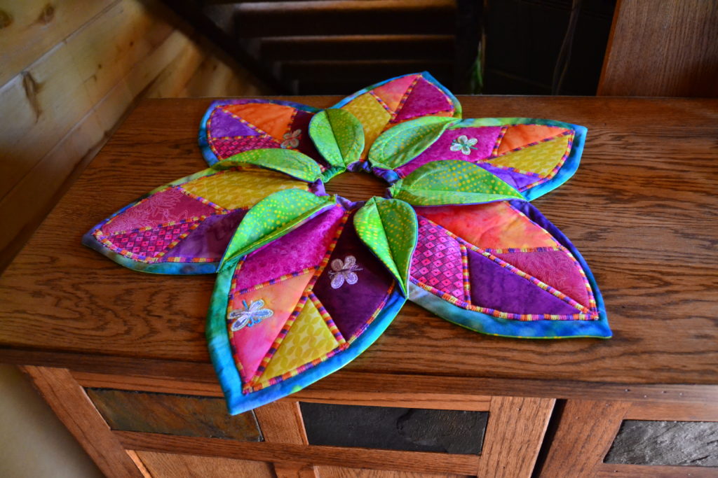
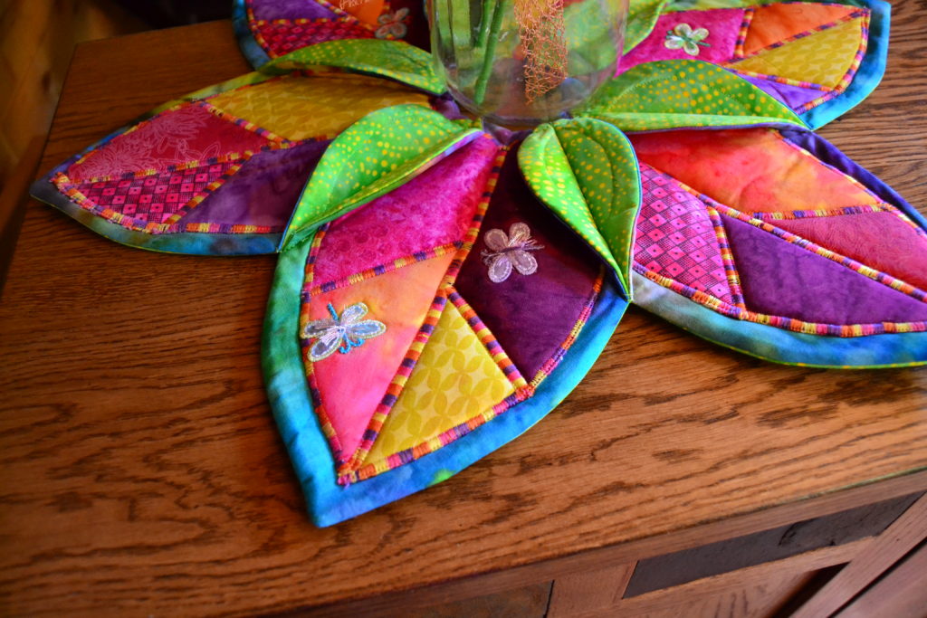
I also prefer the satin stitch – which is just a very tight zig-zag – because it’s more dramatic, covers everything and just looks cool. Variegated thread makes a stunning impact in this instance, as in my ‘Summer Lily Table Topper.’
I used a matching metallic thread to satin stitch around the tails of my mermaids in my Ocean Maidens quilt and that really made them pop. The neat thing about a satin stitch is that you can make it as narrow or wide as you like to achieve the look you’re going for.
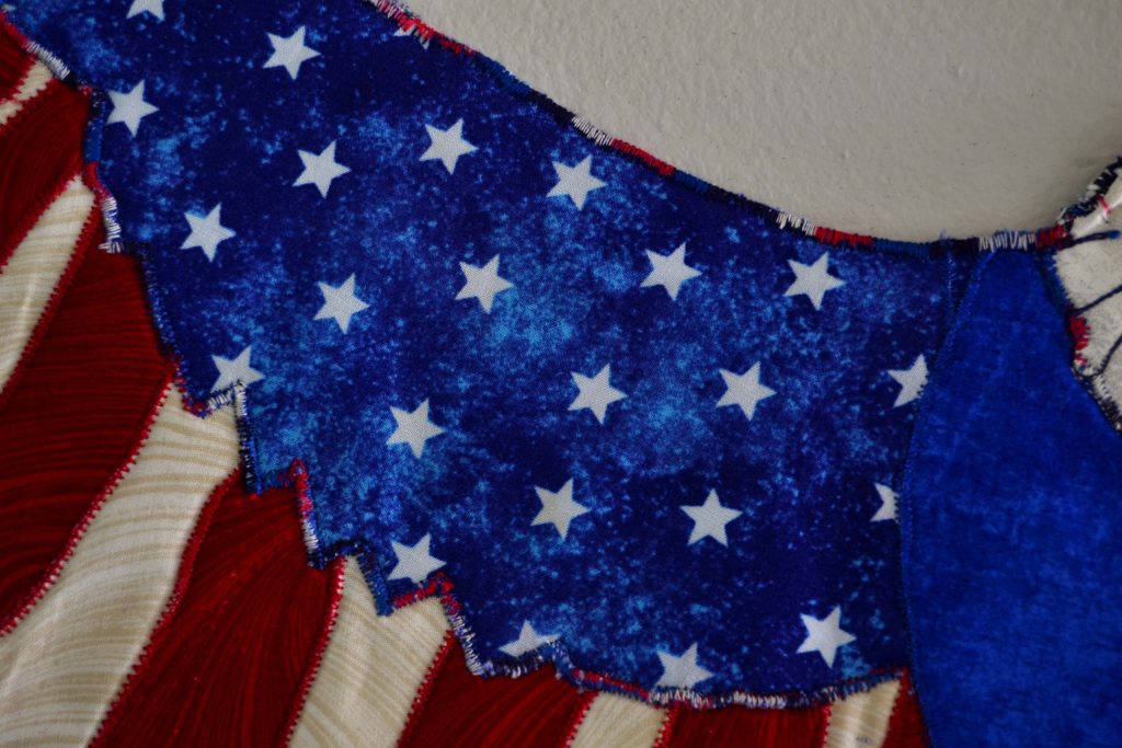
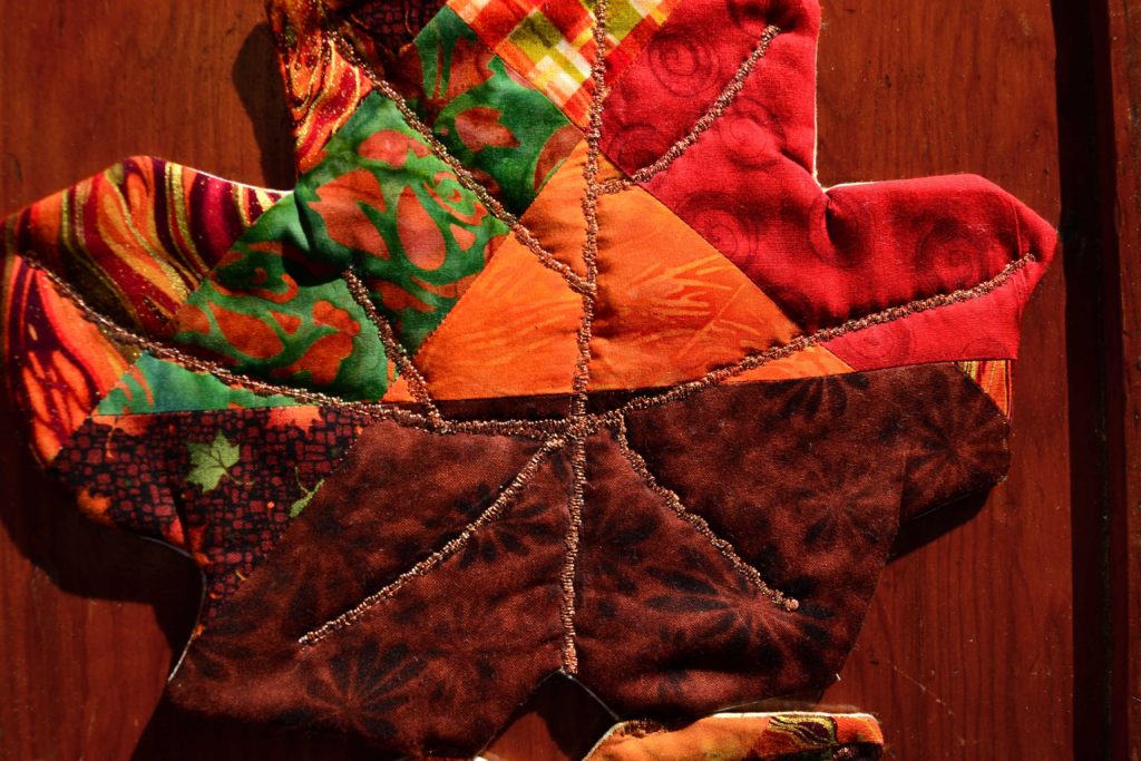
This is a typical use of a satin stitch as an applique technique – it finishes the raw edges neatly with no possibility of fraying 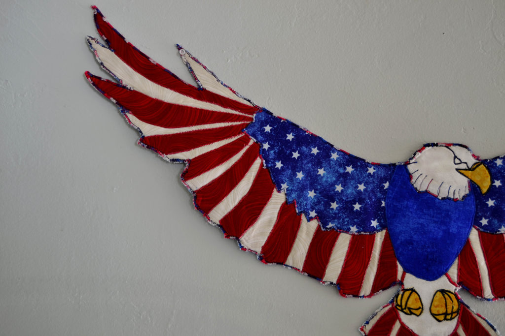
For sharper highlights, one alternative to a satin stitch is using embroidery thread strands 
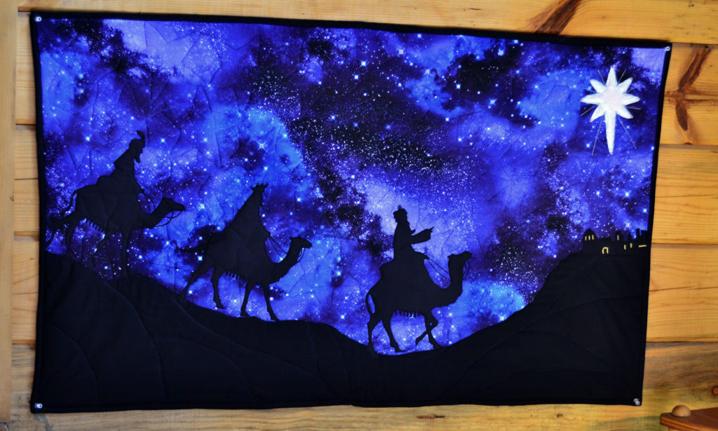
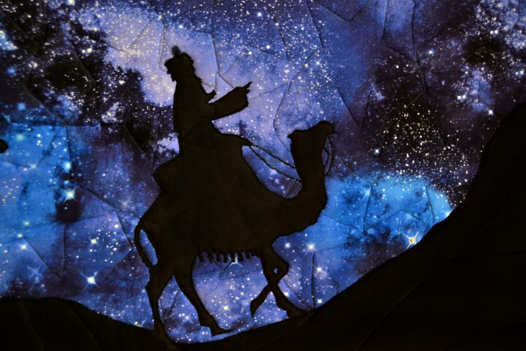
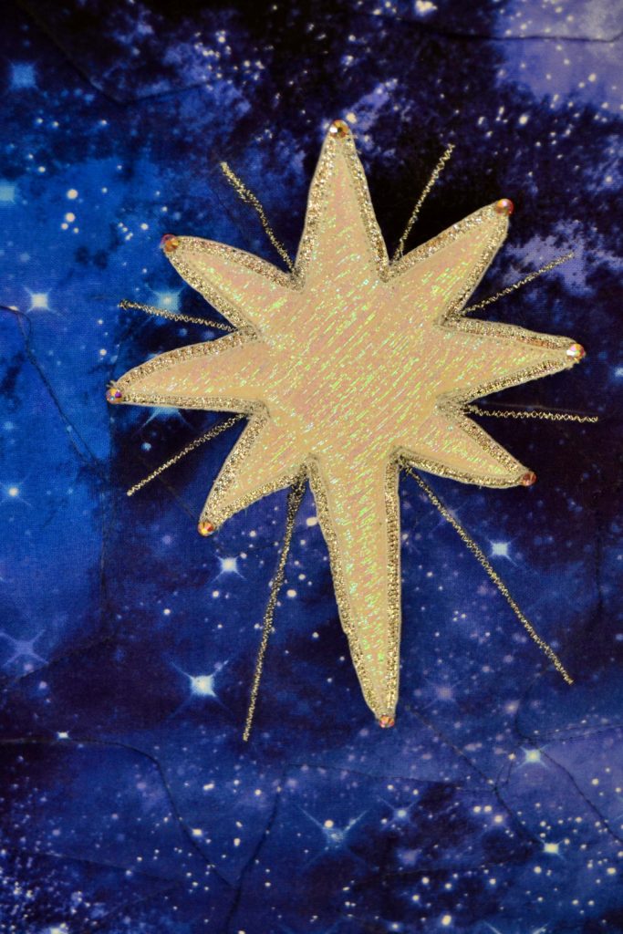
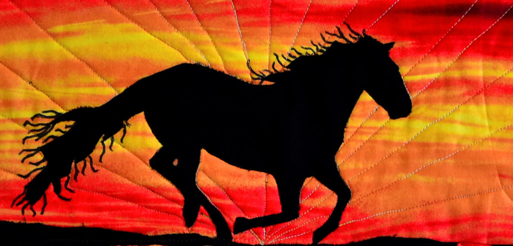
Or a satin stitch can be used to create delicate details, like the thinnest rays of this Star of Bethlehem in addition to appliqueing the fabric down
How to Applique – That’s All Folks!
And that’s it. That’s all appliqueing is – finding the shape you want, cutting it out, applying soft-fuse, and sewing it down.
Don’t let it frighten you. It’s actually a lot easier than it looks, and like everything else practice makes perfect, or as perfect as anything man-made can be. Plus appliqueing is fun, endlessly creative, and saves a lot of time on matching pesky points!
To your increased Quiltivity, see you next time…